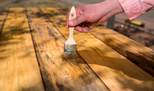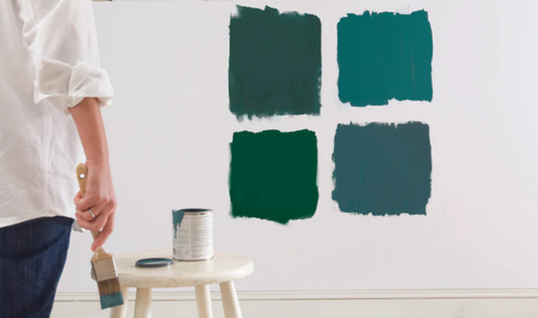
On a small swatch or in a brochure, two similar colours can look almost identical. But once they go up on a full wall, their differences become much more obvious. A shade that felt “calm grey” on paper may read as blue or purple on your wall, while a slightly softer version might be exactly what you wanted.
By painting two or three close options side by side, in a decent-sized patch, you give your eyes a direct comparison. You can see which one feels too dark, too bright, too cool, or just right in your actual light.
Often, it’s only when A is right next to B that you say, “Oh, wow, A is much harsher than I thought.” That saves you from painting a whole room and then feeling like you’re living inside a highlighter.
Side-by-side testing is like trying on two similar shirts in a fitting room – tiny differences matter once they’re on you (or your wall).